Show summary Hide summary
- How the cursive option disappeared from Instagram
- What users are saying — reaction and speculation
- Popular theories on why Instagram pulled cursive
- How this change could affect misinformation and moderation
- What creators and businesses should do next
- Design and accessibility experts weigh in
- What we still don’t know — and what to watch for
Instagram quietly removed its familiar cursive text option from the app’s text tool, and users noticed almost immediately. The change sparked a wave of memes, commentary and wild theories about why the slanted handwriting style vanished from Stories and Reels.
How the cursive option disappeared from Instagram
People began reporting the missing font this week after opening the text editor in Instagram. The italic, script-like choice that many used to add personality to Stories and posts was gone.
Nas slams music industry over disrespect: teases new music, vows to address it
1992 vocal performances: 3 jaw-dropping moments that still amaze
Screenshots and short videos of the update circulated across Twitter and TikTok. Creators compared old and new interfaces. Some said the font was replaced by a cleaner, more uniform typeface.
What users are saying — reaction and speculation
Reaction moved fast. Some users joked about losing the “handwritten aesthetic.” Others shared anger or confusion.

- Memes mocked the change as another tech company erasing personality.
- Influencers noted the shift affected branding for small creators.
- Security-minded commenters floated theories about safety and fraud prevention.
Popular theories on why Instagram pulled cursive
No official, detailed explanation has been published. But the internet has proposed several plausible reasons.
- Accessibility and readability: Simpler fonts are easier to read across devices and help people with visual impairments.
- Moderation and content detection: Removing stylized text can improve optical character recognition (OCR). That may help automated systems identify harmful or misleading content.
- Brand consistency: Parent company Meta may be standardizing typography across apps for a uniform look.
- Fraud and impersonation concerns: Handwritten or cursive-style overlays can be used to fake notes or certificates in scams.
- Licensing and design refresh: Font licensing costs or a planned redesign could prompt removal of older styles.
How this change could affect misinformation and moderation
Stylized text can hinder automated detection. OCR struggles with ornate script.
By simplifying available fonts, platforms may make it easier for algorithms to parse text. That could help flag misleading claims faster.
Experts say improved legibility helps both machines and users. Clearer text is easier for fact-checkers and screen readers.
Why OCR matters
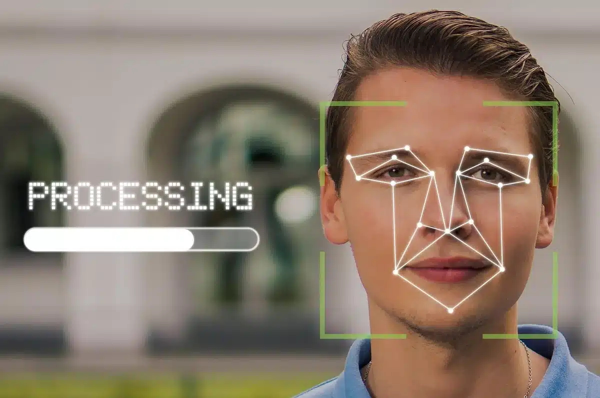
- OCR converts image text into machine-readable text.
- Simple typefaces yield higher OCR accuracy.
- Better OCR helps moderation tools scan for policy violations.
What creators and businesses should do next
Brands and creators who used the cursive look must adapt fast. Here are practical steps.
- Audit recent posts and Stories for visual consistency.
- Choose new fonts that match your voice and remain legible.
- Test how text appears on mobile and desktop screens.
- Use branded stickers or images if fonts no longer match your style.
Font alternatives and tips
- Pick a clean, distinct typeface that reads well at small sizes.
- Combine bold and regular weights to add emphasis.
- Keep line length short and avoid dense blocks of text.
Design and accessibility experts weigh in
Designers emphasize balance between style and function. A pretty font is useful only if people can read it.
Accessibility advocates note that simplified type choices help users with dyslexia and low vision.
Removing ornate fonts can be a deliberate trade-off between creative freedom and broader usability.
What we still don’t know — and what to watch for
Meta has not released an exhaustive rationale. The platform may roll out more changes as part of broader experiments.
Watch for official updates in Instagram’s help center or Policy pages. Also follow creator communities for workarounds and new styling trends.