Show summary Hide summary
- How a classroom moment became a book idea
- The plot: a birthday, a slice of cake and a world-spanning chain reaction
- Designing movement on the page: Ross Collins’s visual plan
- Techniques and choices: pencils, watercolor and fine penwork
- Moments of comic escalation and visual surprises
- Author and illustrator in conversation: playful demands and mutual trust
- Stylistic echoes: clean lines and clear storytelling
- Playfulness for readers and performers
An ordinary school visit gave author Julian Gough an extraordinary spark: a classroom brainstorm that turned into a children’s picture book about how one small action can ripple across the planet. What began as a lesson on storytelling morphed, with the help of a child’s offhand remark, into a laugh-out-loud tale about a kick that doesn’t stop until it has gone far beyond the playground.
How a classroom moment became a book idea
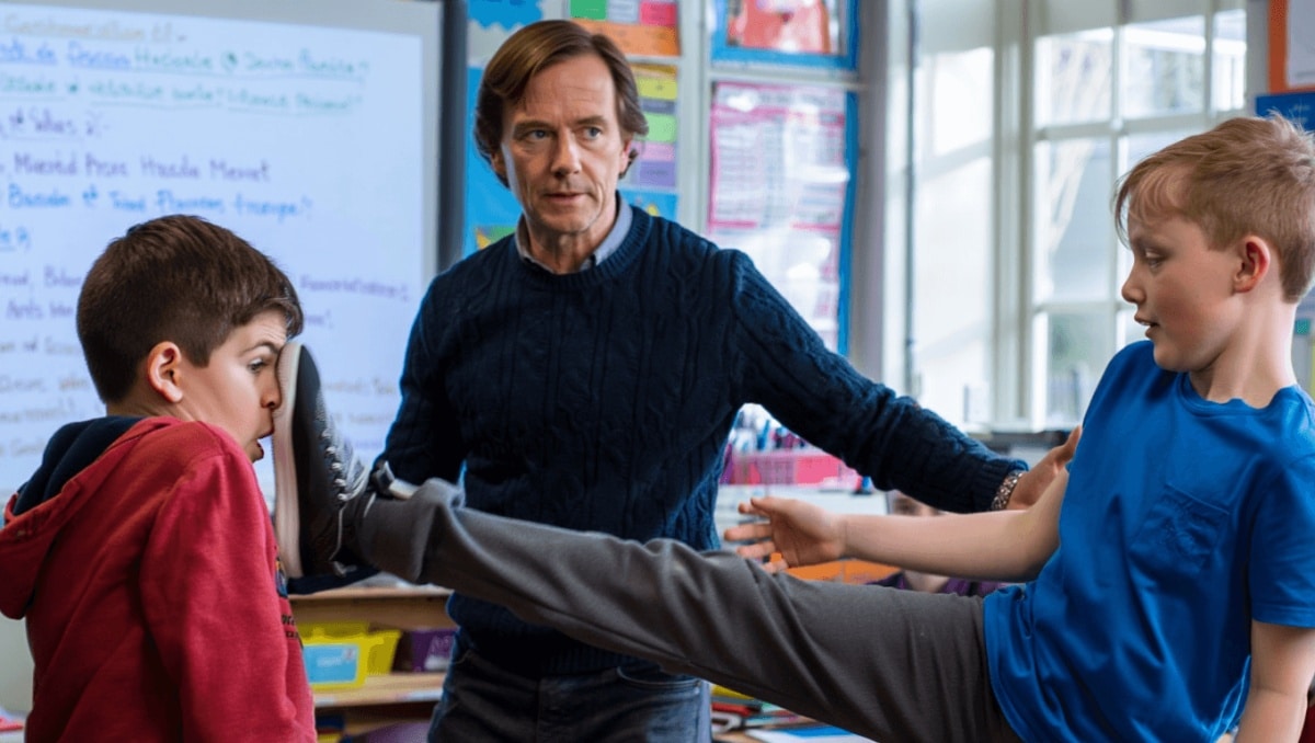
Gough says he was explaining the mechanics of story-making to kids. He wanted to show how events cause other events. The students responded with a simple, escalating scenario: a kick, then another, then another.
Nas slams music industry over disrespect: teases new music, vows to address it
1992 vocal performances: 3 jaw-dropping moments that still amaze
One child suggested sending that kick far beyond the classroom. That single burst of imagination hooked Gough and reshaped the exercise into a picture-book concept.
The plot: a birthday, a slice of cake and a world-spanning chain reaction
The narrative opens on a birthday. Before the celebrant can enjoy his own cake, a friend eats the last piece. Tempers flare. A kick follows. And then the kick becomes a contagion of motion.
When Tad Kicked Vlad follows the chain of kicks as it hops from person to person. The action travels through neighborhoods, sports arenas and across borders. The loop closes back where it began: the kick returns on the next birthday, and the story takes one more mischievous turn.
Designing movement on the page: Ross Collins’s visual plan
Illustrator Ross Collins faced a tricky brief. The story requires a visible through-line of motion. Collins solved that by mapping the kick’s path across detailed scenes.
- He sketched the city from above so readers could trace the kick’s route.
- He staged sequences that let eyes follow the action from street to stadium.
- He used large spreads to show the crescendo of chaos.
Collins wanted children to be able to follow the journey visually. His aerial views and connected vignettes invite readers to scan pages and discover how small actions multiply.
Techniques and choices: pencils, watercolor and fine penwork
Collins began with pencil layouts and moved to watercolor for color and texture. For the line work he chose colored pens over charcoal.
- Charcoal felt too heavy for the book’s busy detail.
- Colored pens allowed for cleaner, more legible action lines.
- Watercolor added warmth and a playful palette.
The result is precise, readable chaos. The clarity of line helps viewers track dozens of tiny stories inside the bigger one.
Moments of comic escalation and visual surprises
Because the book is longer than a typical picture book, Collins had room to play with pacing. Some spreads are packed with small incidents. Others pause on broad, comedic disorder.
- The kick moves through a packed stadium full of fans.
- It ricochets down the aisle of an airplane multiple times.
- At one point, of all things, a chicken appears to signal that total mayhem has arrived.
Collins jokes that inserting a chicken is a shorthand for chaos. The bird is a visual gag that signals to kids: normal rules no longer apply.
Author and illustrator in conversation: playful demands and mutual trust
Gough admits he pushed the illustrations with cheeky, specific requests. Collins took those requests and expanded them.
Their collaboration blends a writer’s appetite for escalating jokes with an artist’s knack for readable composition. The illustrator’s careful lines and lively scenes keep the story grounded, even as the action grows absurd.
Stylistic echoes: clean lines and clear storytelling
The finished pages recall a classic European comic sensibility. The drawings favor tidy outlines and realistic detail, while still embracing the absurd.
Readers who enjoy clear, funny art may spot a nod to Hergé’s Tintin. The comparison rests on shared priorities: uncluttered line, visual logic and a gentle sense of mischief.
Why length matters in this picture book
The extended page count gives both author and illustrator space to expand the central joke. It lets the kick accumulate characters, locales and mini-stories without feeling rushed.
- More pages mean more opportunities for visual callbacks.
- They allow for tempo shifts: long, busy spreads and short, punchy beats.
- Young readers can linger and discover tiny details on repeat reads.
Playfulness for readers and performers
The story’s rhythm and repetitive cause-and-effect make it ideal for read-alouds. Each turn of the page builds anticipation. Kids delight in recognizing how one small act spirals outward.
Interactive moments—like tracing the kick’s path—encourage engagement. Adults reading aloud can play up the momentum and the comedic payoffs.